My whole world has been completely upended after watching the Super Bowl on Sunday. Hannah and I watched it with the little kids, one of their first All American Super Bowl™️©️ experiences with snacks and everything.
We were vaguely rooting for the Chiefs before quickly realizing we seemed to care more than they did. The game was whatever, and then it was halftime.
I was excited about the show. I didn’t know much about Kendrick Lamar or his music coming into this, but I knew enough to know that we were in for a treat. This wasn’t just going to be entertainment. This was a Moment, and he had an opportunity, in front of the world. Was he going to call out Trump directly? Was he going to mention Drake by name?
From start to finish, I was just in awe of the entire thing. I could feel a lot of it going over my head, the deeper meaning, but it was still accessible enough. I think there was something there for everyone to grab onto, even at a surface level.
It’s been interesting to see the depths that people are willing to understand and engage with this performance. All week, my TikTok has been filled up with halftime live reactions, deep dives, and theories. By and large, people Got this thing. It connected, it resonated, and we’re talking about it.
It’s not surprising—sad, but not surprising—that so many people, mostly conservative white people from what I’ve seen, not only refused to engage with this performance but were even offended, as if they were entitied to something else! If the only lyric you recognized was “they not like us” and you were offended by the performance… well, maybe you’re a they. And maybe you should sit with that.
It felt like a stroke of genius that Lamar kept the show so clean. He didn’t swear one time, and the costumes were “safe.” He didn’t have to keep it clean, though I’m sure he was under enormous pressure. But he left absolutely no meat on the bone for anyone left offended by this performance other than to sit with and hopefully reflect upon their own discomfort.
I don’t know how you can watch this performance and not feel something. I don’t know how you don’t see beauty in it, or at least have some curiosity. I think I used to be more tolerant of that kind of willful ignorance, but lately I’ve been exploring what it means to be intolerant of intolerance. Because silence isn’t just passive – it carries responsibility. So I’m not really interested in catering to those who didn’t get the message. I’m not interested in slowing the work of progress to appease those who have chosen to close their hearts and minds.
Was this performance for you? Yes, it was. Whether or not you got what you could have out of it—that’s another story.
In the moment, I didn’t pick up on much of the deeper symbolism. I got the Drake stuff, and when Serena came on... oh my God dude, that was insane. That could be a whole blog by iteself! The shit she got after dancing at the Olympics, the shit she got from Drake. And to see her social afterwards, saying it’s the best 10 seconds of her life! That was next-level.
But that was all secondary to the Narrative. We’ve been moving around the field this whole time, around a big Playstation controller. Sam Jackson has been narrating us through the Great American Game, and his part works on at least a few levels. It’s the criticsm of the White American public who are offended by the performance (“too ghetto”). It’s the voice of pressure from executives that must have been on Lamar to keep his performance within a box. And it represents the rules Black America has to live within every day to survive in this country.
Lamar plays the game for awhile, toning it down, appeasing Uncle Sam/Tom. But soon after, Lamar is hanging with a group of his peers around a steetlight, for which he’s penalized. Just for assembling, for organizing, for existing.
“Scorekeeper, deduct one life.”
He soon sees that the game is rigged for him to lose. So he decides to break free. The game warns him by showing, “Warning Wrong Way” on the video game display in the stands. Will the game correct him, eliminate him, or will he ultimately find a way to break free?
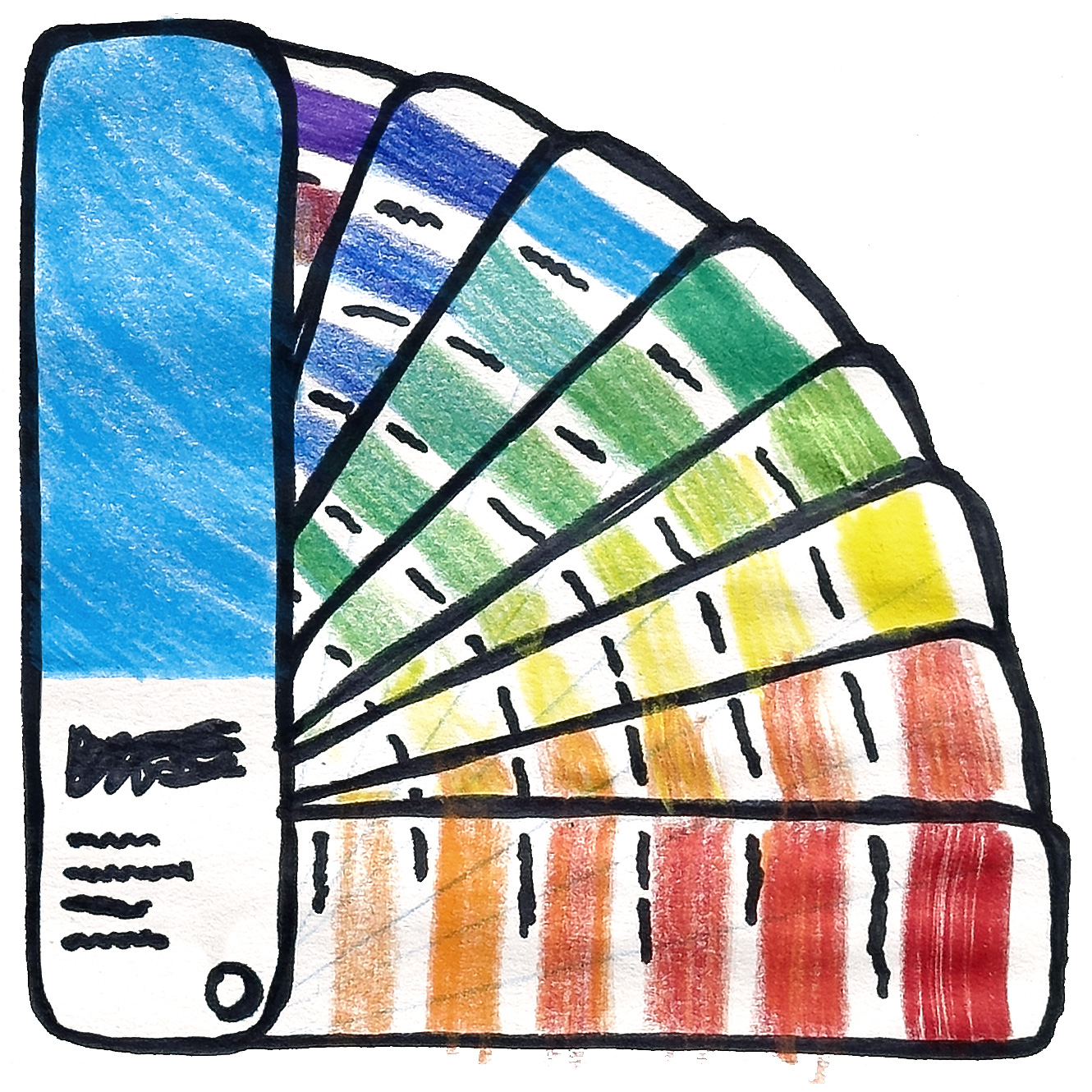
I saw a deep dive on TikTok about the costuming for this performance and the level of depth they went to ensure color consistency, working with manufacturers to get down to the types of fibers that went into the various clothing items to make sure the dyes would adhere to specific Pantone color standards.
Everything was intentional. The level of detail in this performance was staggering. Every costume, every movement, every camera cut—it was all planned.
Did you try and make sense out of the different groups of dancers wearing red, white, and blue? To me it felt chaotic at first, then orderly. Did the red represent Republicans, the blue Democrats, and the white the elites, those in power? You can watch it with that in mind, and there’s something there.
Or maybe the red dancers were blood, danger, chaos. The blue were justice, the law, while the white were angels, purity. Watch it with that in mind and see how that hits.
Kendrick Lamar was laser-focused with this performance and a genius with the power of its symbolism and subtext. He was able to take something as large and messy and complicated as a Super Bowl halftime show and execute a singular vision. He was in total control of how much of the narrative was laid out there for us explicitly and how much was left for interpretation.
And that’s when you know you’re in the terriroty of great art, in the midst of something so large, so powerful and intentional, yet so open to interpretation.
Artists reveal themselves in what they choose to reveal to the viewer.